12 Color Trends 2026 Worth Adding to Your Wardrobe Right Now
Have you ever opened your closet and thought, okay, why does everything suddenly feel a little beige? Same. For this color trends 2026 roundup, we’re getting a much better mix: soft creams and powdery pastels for the quiet days, plus chocolate brown, aubergine, red, teal, and emerald when the outfit needs a pulse.
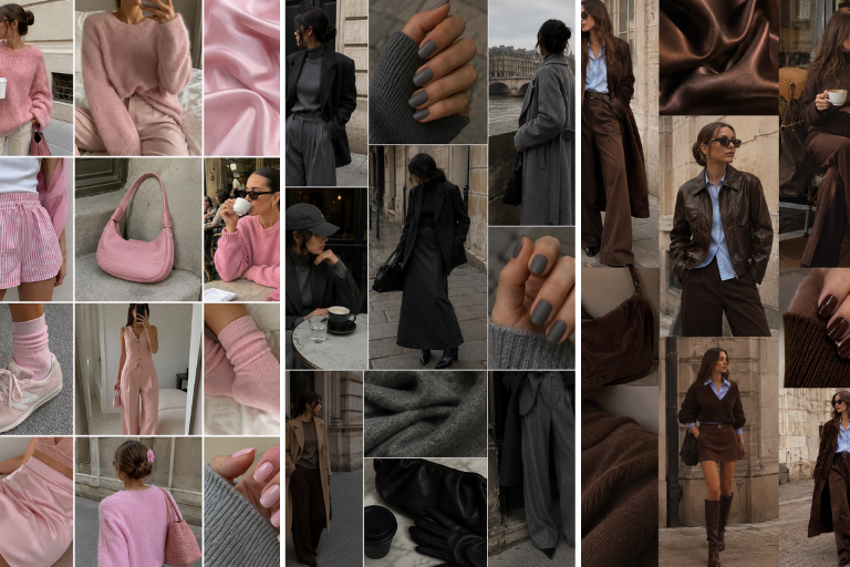
What I love most is how wearable these shades feel once you get past the color swatch and into actual outfits. Silky skirts with chunky knits, sharp trousers with slouchier shirts, glossy nails echoing a sweater, or one rich bag doing half the styling can make a color feel intentional without turning you into a walking moodboard.
Below are 12 color ideas worth playing with, plus the pairings, proportions, and little styling choices that make each one easier to wear with what you already own.
1. Creamy Neutrals With Texture
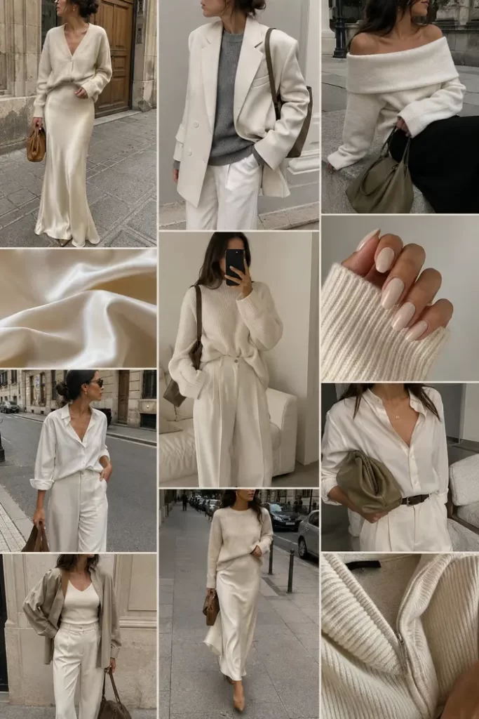
Soft cream earns its keep when you mix textures. A silky slip skirt, roomy knit, crisp shirt, and relaxed tailoring can all sit in the same pale palette without disappearing into one big block of beige because each surface catches the light differently.
I especially like this with one piece that gives the outfit a clearer shape, such as a straighter trouser or a skirt that falls cleanly from the waist. Warm brown bags and delicate gold jewelry are good finishing touches when you want all that cream to feel cozy and polished rather than bridal.
2. Chocolate Brown Goes Tonal
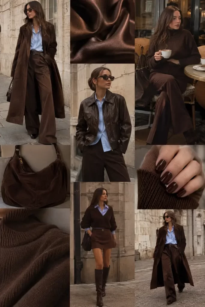
Chocolate brown is doing the job black usually gets, but with a softer, richer mood. The long coat, wide-leg trousers, leather jacket, knit, glossy nails, and slouchy bag show why tonal dressing works best when the textures are not all competing at the same volume.
If your coat and trousers are both relaxed, a closer-fitting knit underneath gives the outfit a little breathing room around the body. Mixing matte knits with smoother leather or a shinier manicure also keeps one brown shade from looking flat from head to toe.
3. Pale Blue Gets Polished
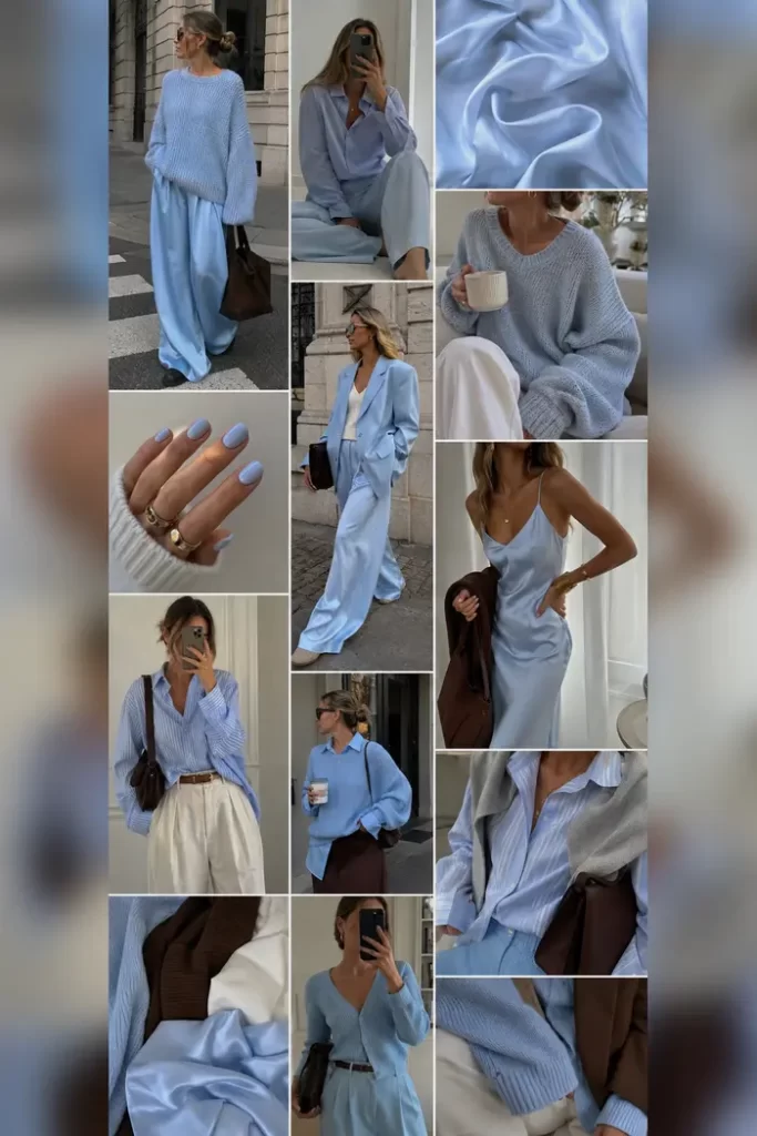
Pale blue gets surprisingly grown-up beside chocolate brown, cream, and white. That deeper brown is especially useful because it gives the icy softness of the blue something warmer to sit against, so the palette feels styled rather than overly sweet.
A slouchy knit with fluid trousers works beautifully for daytime, while satin or a roomy suit makes the color feel sharper after dark. If the silhouette is already loose from top to bottom, I’d keep the shoe cleaner and a little slimmer so the softness does not turn into visual mush.
4. Aubergine After Dark
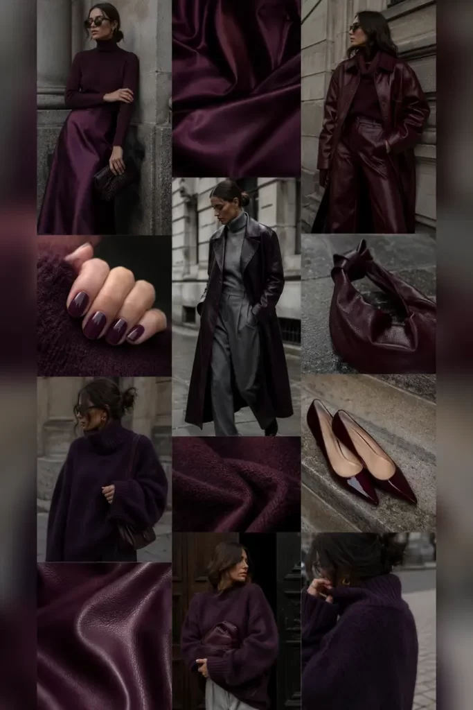
Aubergine has all the drama of burgundy with a cooler, moodier edge, and this collage leans right into it. Pair a deep purple knit or leather coat with charcoal trousers and you get enough contrast to see the shape of each piece without breaking the dark, evening-ish mood.
You do not need to repeat the shade everywhere, either. Glossy nails, a small bag, or pointed pumps are enough to echo it once more without making the outfit feel overly matched.
5. Butter Yellow, Softened Down
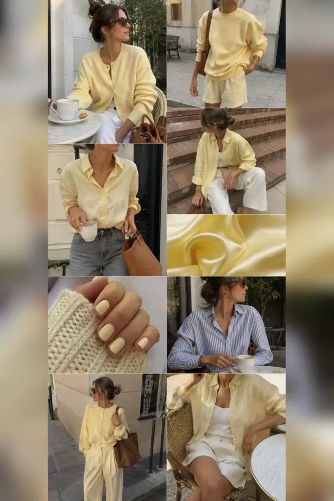
Butter yellow feels sweetest when it is treated like a soft neutral, not a neon statement. The cardigan, easy sweatshirt, breezy shirt, and relaxed trousers all sit beautifully beside white and denim because nothing else in the palette is fighting for attention.
A woven brown bag is such a good grounding piece here. It adds enough depth to stop the yellow and white from feeling washed out, while still keeping that light, easy mood intact.
6. Red With Clean Lines
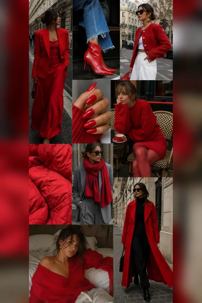
Red does not need much help, which is exactly why these clean silhouettes work so well. A sharp blazer, long coat, sweater dress, glossy manicure, or pointed boot can carry the color almost by itself.
I’d choose one main red piece first, then decide whether the rest of the outfit actually needs more. Black gives it graphic contrast, gray softens it, white makes it feel crisper, and denim takes some of the seriousness out of it. That little bit of restraint is what keeps a strong red outfit looking intentional instead of busy.
7. Pink Grows Up
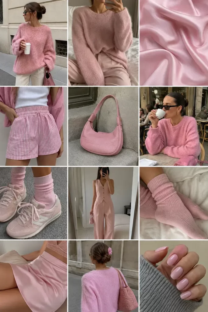
Millennial pink is back with less frosting and more polish. Fuzzy knits, satin, tailored separates, sporty sneakers, socks, and a compact shoulder bag make the shade feel playful without getting sugary.
The trick is letting the shape or texture feel a little more grown-up than the color. A tailored trouser beside a soft pink knit gives the outfit structure, while gray, cream, or chocolate brown adds enough contrast to stop the whole thing from drifting into pastel overload.
8. Navy as the New Neutral
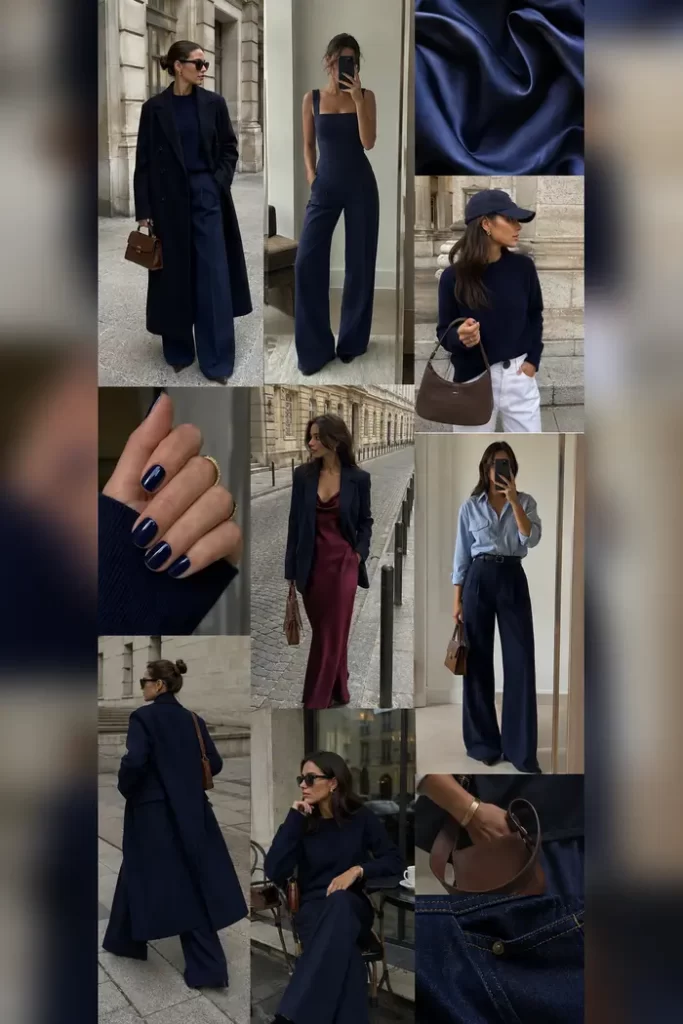
Navy is the easy answer when black feels too expected. A sweeping coat, wide-leg trousers, sleek jumpsuit, fitted knit, and glossy manicure all show how quietly strong it can look without feeling quite as severe.
Brown leather accessories are especially good with navy because they warm up the blue without making the outfit overly colorful. Pale blue shirting works in a different way, creating a softer tonal contrast that lets you layer two blues without everything blending together.
9. Lavender With a Plum Twist
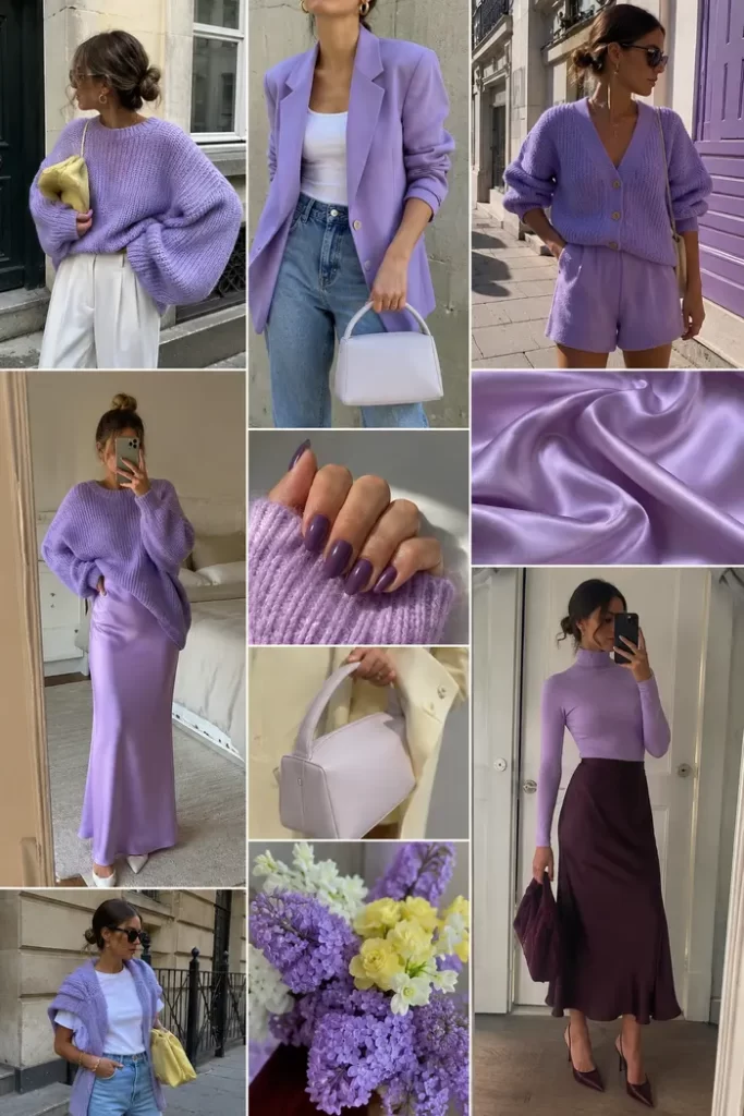
Soft lavender is prettiest here when the shapes stay simple: an oversized knit, tailored blazer, cardigan set, satin skirt, and fitted turtleneck let the color do the talking. Too many frilly details would push it sweeter than it needs to go.
White and denim keep lavender light, while deep plum gives it that slightly unexpected grown-up tension. I also love butter yellow with it in small doses because the two pastels feel fresher together when one is clearly the main color and the other is just an accent.
10. Charcoal in Sharp Layers
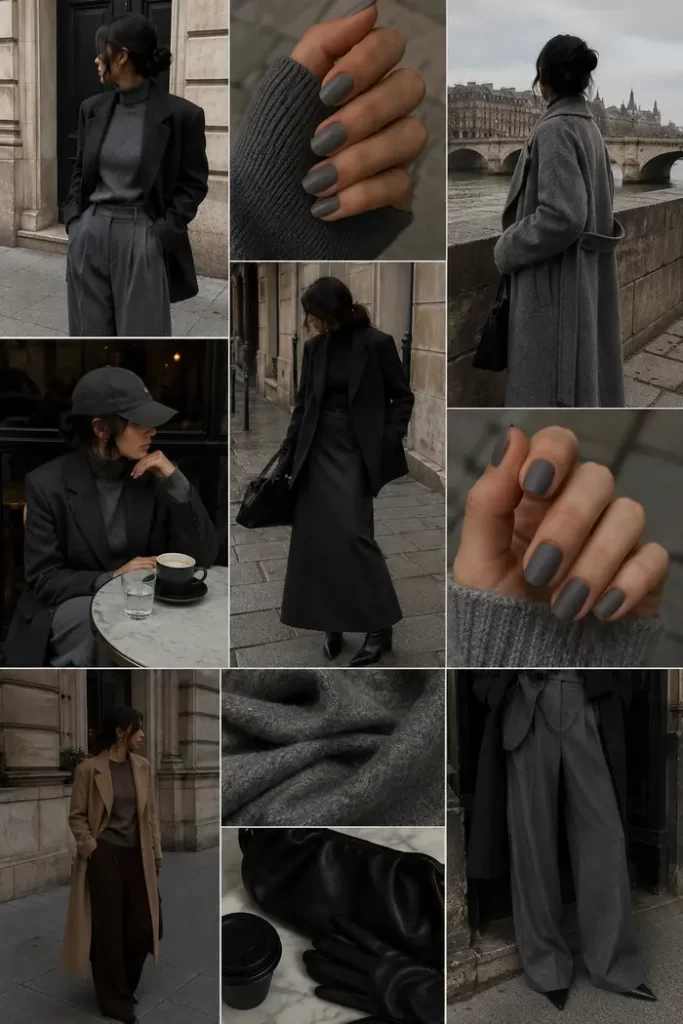
Charcoal gray looks especially good when volume and structure meet. Wide pleated trousers, an oversized blazer, a long coat, chunky knit, and matte gray nails all have enough presence to make the color feel deliberate rather than office-basic.
If you are stacking several oversized pieces, watch where the hems land. A knit that ends clearly above or below the blazer hem usually looks cleaner than two bulky layers stopping at almost the same point. Black leather accessories sharpen all that softness, while a touch of camel keeps the cool gray from feeling too flat.
11. Smoky Teal Meets Brown
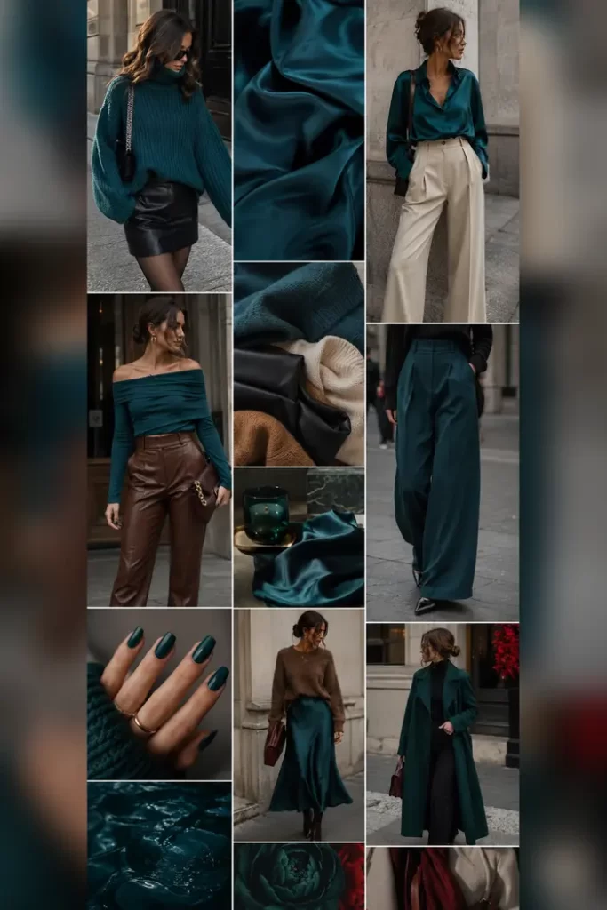
Smoky teal sits in that delicious space between blue and green, so it plays nicely with both warm and cool neutrals. The satin blouse, oversized sweater, leather mini, tailored trousers, and silky skirt show how different the color can feel depending on the texture around it.
Brown leather is my favorite pairing here because the warmth makes teal look deeper and a little more expensive-looking. If you are wearing a silky teal skirt, a chunkier brown knit or structured bag can also give the outfit enough visual weight up top so the shine does not feel too dressy.
12. Emerald With a Wild Accent
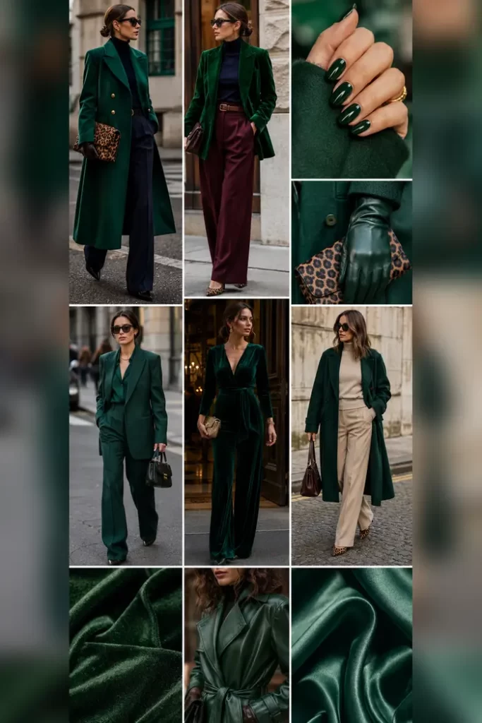
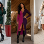
Emerald green goes full polished when the pieces have structure, which is exactly what these coats, velvety tailoring, glossy leather, and clean trousers bring. The richer the green, the less extra decoration it really needs.
I love the tiny leopard accents here too. They cut through the jewel tone with just enough pattern and warmth, but scale matters. A small bag, shoe detail, or narrow accent feels much easier than piling a large animal print on top of an already powerful color.
Which Color Are You Trying First?
The best part of this palette is that you do not have to pick one fashion personality and stick to it. Cream and navy can handle your polished days, while red, aubergine, teal, or emerald can take over when you want a little more drama. Those softer blues, pinks, yellows, and lavenders are also very good at waking up a wardrobe that has slowly become fifty shades of neutral.
If you are not sure where to start, look at the colors you already wear most and choose the new shade that plays nicely with at least three of them. You do not need the matching coat, bag, shoes, and manicure on day one. Sometimes one great sweater or one ridiculously good bag is enough to tell you whether a color deserves more closet space. Which one is calling your name first?