
How to Find Your Skin Undertone (And the Colors That Actually Suit You)
Ever tried on two almost identical pink tops, only for one to make you look ridiculously fresh and the other to make you look like you haven’t slept in three days? Rude, honestly. Especially when both looked gorgeous on the hanger.
Here’s the thing: sometimes it’s not the outfit, your makeup, or even the lighting. It’s the particular shade you’re wearing and how it works with your skin’s undertone.
And once you understand how to find skin undertones, choosing everything from foundation to jewelry to that perfect brown sweater becomes a whole lot easier.
But before you start staring at your wrist veins like they hold the secrets of the universe, there’s something you should know. No single undertone test is completely reliable. The trick is comparing a few different clues and seeing what actually works against your skin.
So let’s figure out whether you’re warm, cool, neutral, or possibly olive-toned, without making the whole thing more complicated than it needs to be.
First, Skin Tone and Skin Undertone Are Two Different Things
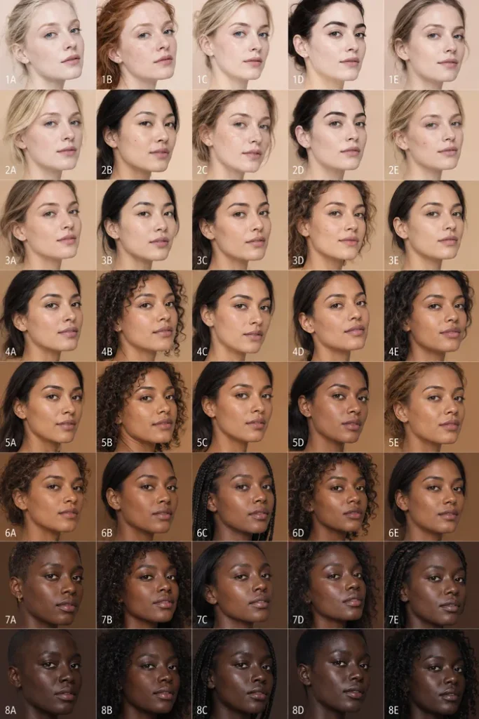
Look at this gorgeous lineup of faces. The complexions range from very fair at the top to beautifully deep at the bottom, but here’s what makes the comparison interesting: even faces with similar skin depths don’t have exactly the same coloring.
Some appear a little rosier. Others have a more golden, honey-like cast. And some look more balanced or muted.
That’s the difference between skin tone and undertone. Your skin tone describes how light or deep your complexion is, while your undertone describes the subtle color cast that influences how makeup and clothing shades appear against your skin.
You can have fair skin with warm undertones, deep skin with cool undertones, or practically any other combination. Your skin depth doesn’t automatically determine your undertone.
And although a tan can temporarily deepen your surface color, your underlying color tendencies generally remain more consistent. Just remember that photographs are useful for understanding the concept, not for diagnosing someone’s undertone. Lighting and camera settings can change how every shade appears.
What Warm, Cool, Neutral, and Olive Undertones Actually Look Like
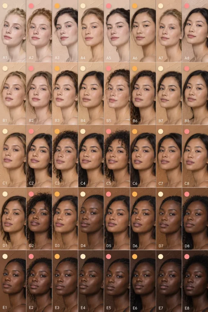
Now we’re getting somewhere. This second chart uses little pink, golden-orange, and pale cream dots above the portraits to illustrate different undertone families across a wide range of complexions.
Think of cool undertones as having more rosy, pink, reddish, or sometimes bluish influences. Warm undertones tend to lean golden, yellow, or peachy. Neutral undertones sit somewhere in between, without an especially strong pull toward either side.
And then there’s olive, the undertone that makes so many people question every foundation they’ve ever owned. Olive coloring often has a subtle greenish, grayish, or muted cast, and it can lean warm, neutral, or cool.
One important detail? These aren’t rigid boxes. Your complexion might be neutral-warm, neutral-cool, or slightly olive without fitting perfectly into one description.
Also, you don’t need to see obvious pink or yellow in your skin to have an undertone. Those differences can be much more subtle, particularly when you’re looking at a single face rather than comparing colors side by side.
The White Test: Does Crisp White or Cream Look Better?
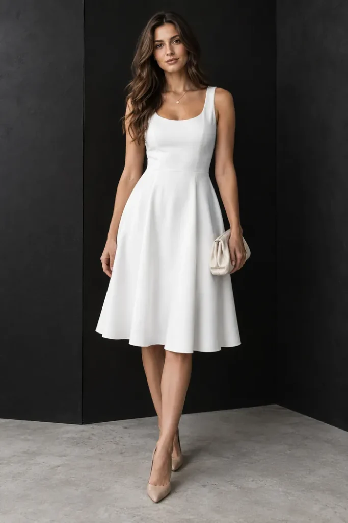
See that crisp white dress? The clean neckline, fitted waist, softly flared midi skirt, and nude pointed heels make it the kind of outfit that looks effortlessly expensive. But for undertone purposes, we’re interested in one thing: that bright white fabric.
Grab something in a similarly pure white shade, then find a second piece in soft ivory or creamy white. The dress pictured is bright white, so you’ll need to supply the cream comparison yourself.
Stand near a window in indirect daylight, without foundation or heavy makeup, and hold each fabric just below your chin.
If crisp white makes your complexion look clearer and more balanced while cream seems slightly yellow against you, that may suggest a cooler undertone. If creamy ivory looks harmonious and bright white feels a little harsh, you may lean warmer.
And if both work beautifully? Neutral is definitely worth considering.
Just don’t treat this as a final answer. The brightness of the fabric and your natural contrast can influence the result, too. You’re gathering clues, not taking a science exam.
The Jewelry Test: Gold or Silver, Which One Makes You Glow?
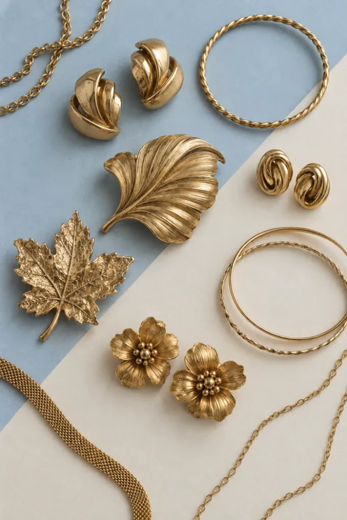
First of all, can we appreciate this jewelry collection? Those sculptural knot earrings, textured gold bangles, delicate chains, and oversized botanical brooches are giving vintage treasure chest in the best possible way.
But beyond being pretty, jewelry can offer a useful little hint about your undertone.
The traditional rule goes like this: yellow gold often complements warm coloring, while silver or white gold can look especially harmonious with cool coloring. If both flatter you equally, you may have neutral undertones.
Since the photo shows gold pieces, you’ll need a silver necklace, earring, or bracelet to make a proper comparison. Try to choose pieces with similar finishes and hold them near your face in the same lighting.
Rather than deciding which metal you personally love more, look at what happens to your complexion. Does one make your skin look more even and lively while the other seems less harmonious?
Still, jewelry is a styling preference as much as an undertone clue. You might look amazing in both metals, prefer one because of your wardrobe, or love the contrast of the supposedly opposite metal.
And honestly, no color analysis should ever make you break up with your favorite gold hoops.
The Vein Test: Helpful Hint or Internet Beauty Myth?
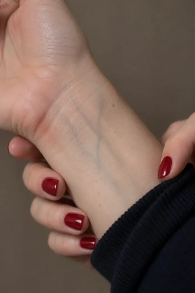
Ah yes, the famous wrist-vein test. You’ve probably seen this advice approximately a thousand times, and it’s always presented like your veins are about to reveal your entire beauty personality.
In this close-up, you can see faint blue-green veins beneath the wrist’s surface, with that glossy burgundy manicure adding a little contrast.
The popular guideline says blue or purple-looking veins suggest cool undertones, green-looking veins suggest warm undertones, and a mixture could point toward neutral coloring.
Here’s the catch: vein color isn’t a reliable way to determine undertone by itself.
The color you perceive depends on how light passes through your skin, the depth of the veins, and the lighting around you. Veins are also much harder to distinguish on some complexions, especially deeper skin tones.
So if your veins look blue in one room, green in another, or aren’t clearly visible at all, don’t panic. That doesn’t mean your undertone is impossible to identify.
Consider this a possible supporting clue, then move on to comparisons that show how colors actually look against your face.
Your Wardrobe Might Give You Better Answers Than Any Quiz

Now THIS is the kind of undertone test I can get behind. Two friends, a clothing rack, and an excuse to try on half the store. Research, obviously.
In the picture, they’re comparing a soft pink floral blouse with a rich blue-teal button-down. Those are quite different colors, but the idea is exactly what we want: noticing how fabric shades behave when they’re placed near someone’s face.
For a more useful at-home experiment, pull out a few pieces from your closet in contrasting color temperatures. Think raspberry pink versus peach, cool taupe versus camel, or blue-red versus tomato red.
Hold each one directly below your bare face in consistent daylight, ideally choosing fabrics with similar brightness and depth.
Pay attention to the overall balance. Does one shade make your complexion appear more even? Do your eyes seem more noticeable? Does another color exaggerate shadows or make your skin look oddly yellow or gray?
If several cooler colors consistently feel more harmonious, you may lean cool. If the warmer versions tend to complement your complexion, warm could be your direction.
And if both look good, your best colors may have more to do with softness, saturation, or contrast than a strictly warm-versus-cool distinction. Which, frankly, is why trying clothes on beats memorizing a bunch of rules.
A Color Wheel Helps, but Not Every Rainbow Is an Undertone Chart
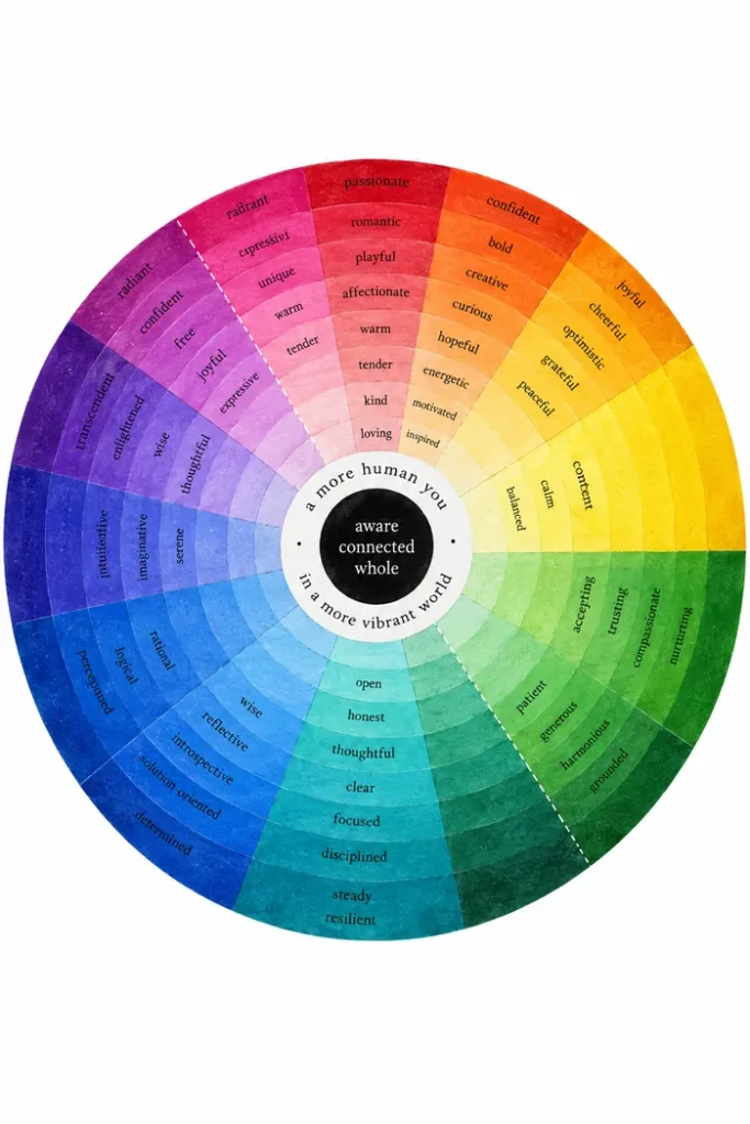
Okay, how beautiful is this color wheel? It moves from rich purples and electric blues through calming greens, sunny yellows, fiery oranges, and rosy pinks.
Look a little closer, though, and you’ll notice words like “joyful,” “calm,” “thoughtful,” and “confident.” This particular wheel explores colors alongside emotional qualities. It isn’t a scientific skin-undertone chart or a guide that can assign you a seasonal palette.
What it does beautifully is remind us how much variety exists within color.
And this matters because finding your best colors isn’t simply about deciding that blue is good and orange is bad, or the other way around.
Colors have different versions. A pink can lean blue and look almost berry-like, or lean yellow and turn peachy. A brown might feel smoky and grayish or rich and cinnamon-warm.
Even when two shades belong to the same color family, they can have completely different effects against your skin.
So use the wheel for color inspiration, then test actual fabrics side by side. We’re looking for the specific versions of colors you enjoy wearing, not trying to eliminate half the rainbow from your life.
The Behind-the-Ear Test: Look Beyond Your Cheeks
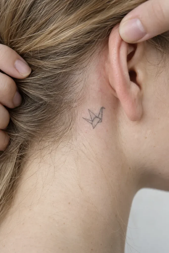
Here’s a spot you probably haven’t examined while getting ready: the skin just behind your ear.
The photo shows blonde hair being pulled away to reveal the area beside the ear, complete with a tiny fine-line tattoo. It’s a useful reminder that your cheeks aren’t the only place you can look when assessing your natural coloring.
Your face can have temporary redness, blemishes, pigmentation differences, or makeup residue that makes its undertone harder to judge. Areas around the jaw, neck, and behind the ear sometimes provide additional clues, particularly when they’re less exposed to sun and makeup.
But don’t decide you’re cool-toned simply because the skin around your ear appears pink. Pressure, irritation, shadows, and lighting can all affect what you see.
Want a more practical confirmation? Try three foundation shades with the same approximate depth but different undertones: warm, cool, and neutral. If standard shades repeatedly look too orange or too pink, include an olive option.
Apply small stripes from your jawline toward your neck, let them settle, and check in indirect daylight. The closest match should blend into your natural coloring without leaving an obvious pink, yellow, orange, or gray stripe.
This is especially helpful if your main goal is finding foundation that actually matches. Your clothes can help you explore flattering colors, but a proper skin-to-foundation comparison is much more relevant for makeup.
Cool Pink vs. Warm Pink: Same Color Family, Very Different Vibe
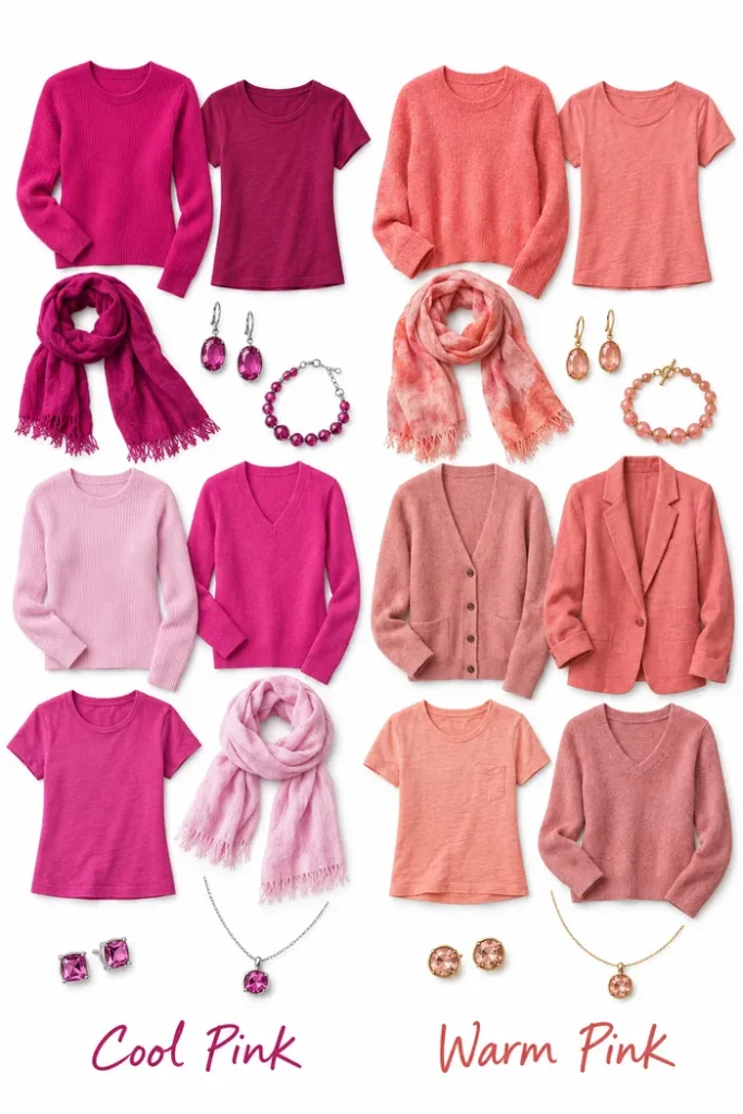
This comparison is exactly why I never recommend swearing off an entire color just because one version didn’t flatter you.
On the left, the cool pink wardrobe is full of vivid raspberry, magenta, and blue-based fuchsia. Even the coordinating scarves and gemstone jewelry lean toward those rich, berry-like shades.
On the right, everything gets softer and warmer. There are peachy-pink T-shirts, a salmon-colored knit, a dusty rose cardigan, and coral-toned accessories paired with gold jewelry.
Both sides are pink. But they’re telling two very different color stories.
If you have cool undertones, blue-based pinks may feel more harmonious against your face. If you’re warm-toned, peach, coral, and warmer dusty pinks might be easier to wear.
But there’s no need to take this as a restriction. A warm-toned person might look incredible in saturated fuchsia, while someone cool-toned might love the contrast of a peach blouse.
Here’s the fun part: if a particular pink doesn’t work the way you want near your face, wear it as a skirt, trousers, handbag, or shoes instead. You still get the color you love without relying on it to frame your complexion.
Cool Brown vs. Warm Brown: The Neutral Color Trick Nobody Mentions
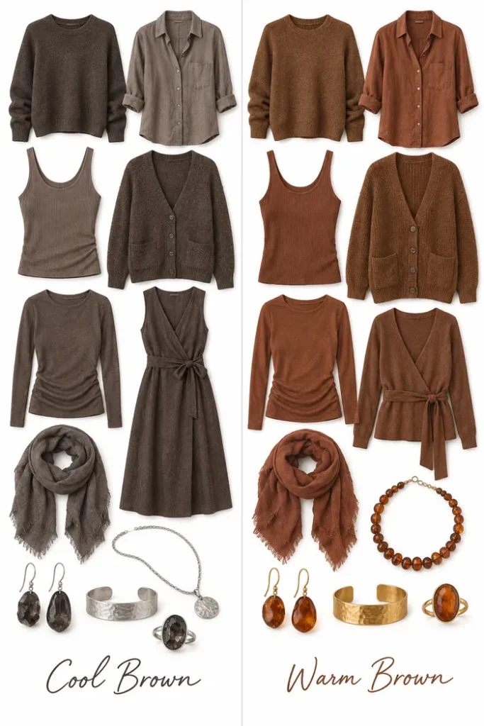
If you’ve ever wondered why one brown sweater looks insanely chic on you while another makes everything feel a little flat, this comparison might explain it.
The cool brown side is full of smoky taupe, mushroom brown, and grayish cocoa. Notice the soft gray-brown button-down, the deep muted cardigan, and the coordinated silver jewelry with smoky stones.
Meanwhile, the warm brown side practically smells like cinnamon coffee. We’re talking caramel knits, reddish-brown shirts, a warm wrap-style dress, rust-colored scarves, and amber jewelry with rich golden accents.
Neither side is universally better. They’re simply different interpretations of brown.
Cooler complexions may prefer taupe, greige, or muted cocoa near the face, while warmer complexions may find cognac, camel, and cinnamon more harmonious.
Try comparing similar pieces rather than completely different outfits. A cool brown sweater next to a warm brown sweater tells you much more than comparing a grayish cotton T-shirt with a textured rust-colored coat.
And if beige has always felt impossible on you, don’t give up yet. You might simply have been shopping for the wrong kind of beige all along.
Cool Orange vs. Warm Orange: Why Coral and Pumpkin Aren’t the Same
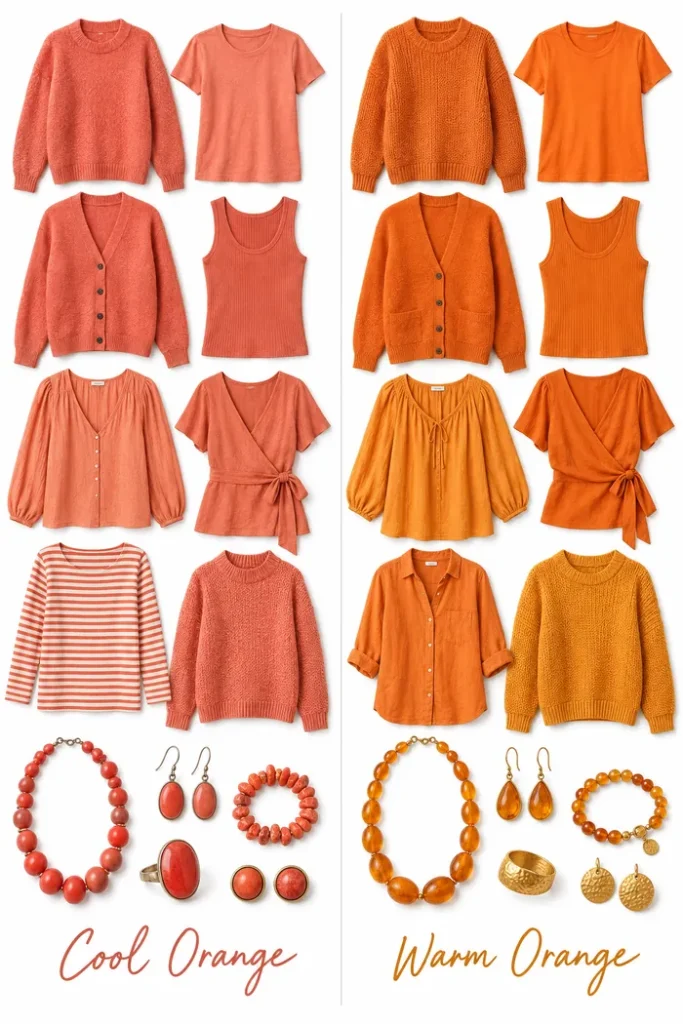
And now for the color that can be surprisingly tricky: orange.
On the left, the clothes lean toward pinkish coral, soft salmon, and muted reddish-orange. The matching jewelry has that same rosy-coral character.
On the right, we’re in full pumpkin-spice territory. Bright tangerine T-shirts, rich orange cardigans, golden-orange knits, and amber-colored accessories bring a much more yellow-based warmth.
Now, technically, orange is considered a warm hue on the traditional color wheel. When this graphic says “cool orange,” it means orange shades that are relatively cooler because they lean more toward pink or red rather than yellow.
That distinction is useful when you’re shopping. Someone might look wonderful in peachy coral but feel overwhelmed by vivid pumpkin orange, even if they generally lean warm.
And someone with cooler undertones might find that a pink-leaning coral is easier to style than a bright golden tangerine.
Brightness and saturation matter, too. A muted terracotta, a soft coral, and a neon orange will create very different effects, regardless of your undertone.
The lesson? Don’t ask whether you can wear orange. Ask which orange feels most flattering and most like you.
So, How Do You Actually Know You’ve Found Your Undertone?
By now, you might have noticed that a lot of these tests point toward possibilities rather than delivering one magical answer. And that’s completely normal.
The most useful approach is to look for patterns. Compare crisp white against cream, try warm and cool versions of the same clothing color, and check a few foundation undertones at a similar shade depth.
If several different comparisons consistently suggest the same direction, you’ve probably found a useful starting point.
If the results are mixed, you may be neutral, olive, or somewhere between undertone families. It’s also possible that the brightness, depth, or softness of a color matters more for your appearance than whether it’s traditionally warm or cool.
And please don’t feel like you need to buy an entirely new wardrobe the second you discover you’re warm or cool-toned. Start by noticing the colors you already love wearing and what those shades have in common.
FAQs About Finding Your Skin Undertone
Can you have cool undertones with dark skin?
Absolutely. Cool, warm, neutral, and olive coloring can appear across different skin depths. Having deep skin doesn’t automatically make you warm-toned, just as having fair skin doesn’t automatically make you cool-toned. Compare makeup and fabrics against your own complexion rather than assuming your undertone from skin depth.
What if both gold and silver jewelry look good on me?
You might have neutral undertones, but jewelry alone isn’t enough to confirm that. Metal finish, contrast, personal preference, and the rest of your outfit all affect how a piece looks. Use the white-versus-cream comparison or foundation swatches for additional clues.
How do I know if I have olive undertones?
Olive skin often has a subtle greenish, grayish, or muted quality. One common clue is that foundations at the correct depth still seem too orange, pink, or overly saturated. Comparing a dedicated olive or muted foundation shade with warm, cool, and neutral options can help you figure out whether olive is a better match.
Does tanning easily mean I have warm undertones?
No. How your skin responds to sunlight isn’t a reliable way to classify cosmetic undertones. People with different undertones can tan or burn, and sun response depends on more than whether your coloring leans warm or cool. There’s no reason to expose your skin to extra UV radiation just to figure out which colors flatter you.
Can I wear warm colors if I have cool undertones?
Of course! Undertone analysis is a styling tool, not a dress code. You can create contrast deliberately, choose a softer or deeper version of a color, or keep a challenging shade away from your face. If you love how you look in something, that’s a pretty excellent reason to wear it.
The Final Word on Skin Undertones
Finding your skin undertone isn’t about discovering a secret rule that suddenly makes half your closet illegal. It’s about understanding why certain colors seem to click with your complexion and using that information to shop a little more confidently.
Start with daylight, compare actual colors against your face, and use foundation swatches when you need a close makeup match. Don’t let one wrist vein or a random online quiz make the entire decision for you.
And remember, the right color isn’t necessarily the one some chart says you should wear. It’s the one that makes you look in the mirror and think, “Okay, yes. This is the one.”
Now I’m curious: are you team warm, cool, neutral, or still figuring out where your undertone fits?
Related posts:
 How to Dress When You Have No Waist: Easy Styling Tricks That Make Outfits Look More Defined
 How to Live a Soft Life: 9 Tiny Shifts That Make Everyday Life Feel So Much Better
 How to Grow Thick Hair Without Turning Your Bathroom Into a Lab
 Glow Up Tips That Make You Feel Prettier and More Like Yourself
